User onboarding in product design: how to get it right
User onboarding in product design: how to get it right

Do you want to entice your customers to your new or updated service and are planning an onboarding sequence? Or are you a designer who is responsible for creating an onboarding experience? Then here are some tips on what to consider.
A user onboarding experience
We’ve all seen them: onboarding screens, these clever carousels when opening an app for the first time. Or pop-ups guiding us through a feature jungle when using a new software.
I don’t know about you, but I have only seen a handful of useful examples. I rarely read instructions before diving into a tool. I learn by doing and don’t want to get lectures without being able to apply what I learn right away.
Far too often, onboarding experiences seem to be just another checkbox on the “best practice” list. But just because we see a certain pattern repeatedly out there doesn’t mean it is actually useful.
Let’s be smarter and not just copy cats. Here are some tips on when and how to use user onboarding. Before we start, let’s first get on the same page.

What is user onboarding?
There is a lot of information about onboarding out there – but depending on the context, onboarding can mean very different things.
Software companies, especially in the B2B space, will talk a lot about customer onboarding. This is a big picture view of your customer’s end-to-end experience of a product across different touch points. The goal is to create a strong relationship to keep customer retention.
In this article, I will talk about user onboarding, which can be a part of of customer onboarding. It focuses on the usage of a product. The goal is to ensure a successful interaction with a software and showing its value.
User onboarding is the process of guiding new users to find value and be successful in using a software.
What is the purpose of user onboarding?
Providing a user onboarding process can have multiple benefits:
- It can provide an introduction of your software without lengthy documentation
- It can support the discoverability of new or unconventional features
- A successful onboarding experience can generate trust in the brand
- It can support engagement and help build behavioral patterns
👉 If you are designing an onboarding experience, think about your objective first.
When do we use onboarding?
While “onboarding” is also about the first impression a user will get of a product, it can cover a longer time period than just the first interaction.
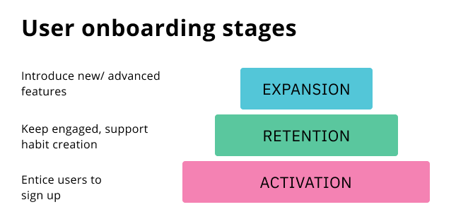
There are three main stages in a user journey where user onboarding can be relevant:
- User activation: entice users to sign up for a service and start using it
- User retention: engage users to return and keep using the app
- User loyalty: keep users satisfied and introduce advanced features

👉 Think about your customer’s journey: at what stage do they need most encouragement at the moment? Start there.
How do we do user onboarding?
Depending on your goals, there are different options to consider. It’s more than just a couple of screens before a user signs up for your app.
Let’s take a look:
User Activation
If your goal is get new customers to sign up for your product, you need to show them the value: how is this product making their life better?
Here are different ways of doing this:
- Product video: quick walkthrough of the main features
- Screenshots: static images to show the main product areas
- Demo version or free trial
- Free version with a limited feature set
Important to consider:
- Show any features you think your user expects to see (the must-haves)
- Include features that differentiate your product from competitors (the delighters)
- Avoid focusing on unimportant features (indifferent or neutrals)
- Also avoid to overexplain functionality. This is not the time to go deep into “how to use it”; focus on “what you get.”
👉 Be clear about your customer needs and the competitive offers on the market: what are must-have features? What are differentiators?
📖 Learn more about the KANO model to analyze your product features
User Retention
If your goal is to keep users engaged and return to use your product on a frequent basis, you need to support a behavioural change and get them excited.
There are lots of ways to accomplish that, here are a few ideas:
- Onboarding tutorial over time: share regular messages with tips on how to use the product
- Tooltips: show in-context tips over time to help a user advance their skill level
- Task list & progress bar: provide steps a user has to do to get familiar with a service
- Resource center with tutorials: offer educational and support content that is accessible to users whenever they want it
- Gamification: provide a form of rewards for frequent usage
Important to consider:
- Put yourself in your users’ shoes to guide them from being a first-time user to an experienced user (what do they need to learn first, second, third)
- Don’t overwhelm your user. Split content into small bites
- Don’t force users to go through educational content and always provide a way out
- Offer frictionless self-service support options
👉 Use a progress map to gain clarity about the steps you want your users to go through from a first-time user to an advanced user: how can you help them to feel successful?
📖 Learn more about UX mapping methods
User Expansion
If your goal is to increase loyalty, you want to ensure a high customer satisfaction to build a positive relationship.
Technically, we are not talking about user onboarding anymore – but your onboarding process has an impact on your customer relationship and trust you create.
Some ways to ensure a positive relationship:
- Gather customer feedback to continuously improve the experience
- Collect customer data for more personalized messages and tips (like mini surveys about their roles, knowledge level and objectives)
- Implement loyalty programs and gamification to strengthen relationships
- Invite users for beta-testing
Important to consider:
- It’s easier to loose trust than to gain it: be transparent and supportive in all of your messages
- Give your customers the feeling of being heard
- Keep the focus on providing value and avoid feature creep
👉 Do continuous research to stay up-to-date with your customers’ changing needs, expectations and pain points.
📖 Learn more about strategic UX research and continuous UX research
Example: how not to do it
We all want happy customers. When we don’t get the user engagement we were hoping for and only look at some numeric data, we might quickly y come the conclusion of: “They just don’t get it. Let’s add some user onboarding to help people understand our product.”
And this can result in a recent example I experienced as a user.
The context: I made an online order and received a while later an email notification to track my order.
Here is the email notification: Yes, let’s track my package. (Before you scroll further down, take a second to think about what you would expect to see. What information is relevant to you?)

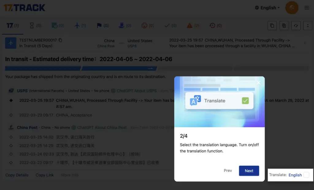
I clicked on the link and was transferred to a webpage that started with an onboarding message. I was surprised at first: all I need is to see where my package is currently and its estimated arrival date. Who needs instructions for that?
And then I took a second to look at the instructions: this sounds like WORK. I had no clue what they were trying to tell me, what numbers I was supposed to clear and extract.

There was no way to close this message, I could only select the “Next” button. Which then offered me a language selection – with the option to translate everything into English – but all of the content is already in English??

Next, I got what seemed to me in the beginning as even more steps and instructions — until I realized that they were just explaining buttons to me (what would I need any of these features for?? I just want to know where my package is).

Then, finally, I get a timeline…and a goodbye message (more clicks and buttons). I click finish…

Then, I got to what I had been interested in all along. But:
- the timeline has changed (the timeline in the previous screen was just an example, not MY timeline)
- there are tons of icons including sad smiley faces and alerts that I have no clue what to do with
- there is ChatGPT information to learn more about the carrier….that’s what I always wanted! (so not)
- a language selector top AND bottom (which one is correct?)
- Copy details, copy link: what’s the difference? Similar to buttons at the top??
- the information that I am REALLY interested in (when will I get my package) is not available and will be very hard to see on this screen.

This to me is a big UX fail for user onboarding.
It seems that most of the onboarding information might have been relevant to a sender but not to a receiver.
—> make sure to provide information to your right audience and user group
The information in the onboarding tutorial was also pretty basic. If you have to explain to your users the basic functionality of your application, you know you did something wrong in your UI design.
—> Design your product with a good usability and affordance. Focus on simplifying before thinking about adding explanations around usage.
Examples: good approaches
There are lots of resources out there with a collection of good user onboarding examples. Some great sources for inspiration are:
Onboarding Study (examples from over 220 SaaS products)
User Onboarding Academy (mix of SaaS tools, apps and platforms)
I will include only a few to give you some ideas and inspiration:
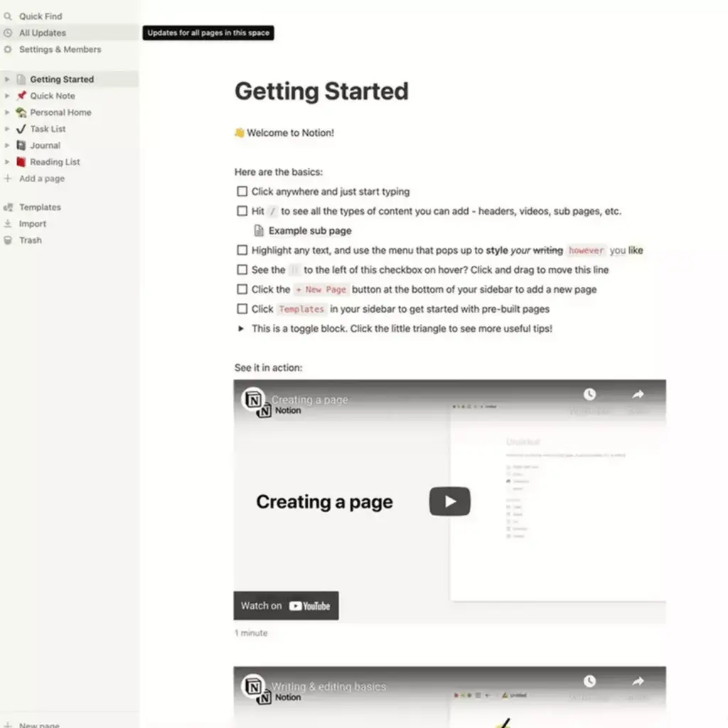
Notion: Welcome message and checklist for first-time users
While users might have a rough understanding of what they can use this product for, there are lots of hidden features and with such a powerful tool like Notion, it can easily be overwhelming.
Notion provides a welcome screen with video walkthroughs and a task list that helps first-time users get oriented.
This page is always accessible (a user can come back at any time), but it can also be skipped or deleted if the user doesn’t find it useful.

Canva: In-context support messages for advanced users
Canva offers messages if they see their users are doing something new or if there is a hidden feature that a user hasn’t used before. It seems very data-driven and personalized – a great way to provide additional value even for advanced users.

Miro: In-context to self-serve message
Similar to Canva, Miro provides tips whenever they release a new feature or seeing a user interacting with an item for the first time. They also let users know that they have access to a pool of tutorials where they can find tips and support whenever they need it (choosing between different methods of in-app tutorials or videos).


Checklist: Considerations for user onboarding
To ensure that your onboarding solution is valuable and helping you achieve your objectives, consider these questions before you decide on a solution.
For existing products:
Review your current product and its interface:
- Are there any parts in our interface that are not easy to understand or we know our users struggle with? —> Explore first ways to simplify your UI before adding an onboarding tutorial.
- Use A/B testing to test different solutions
- Are there any hidden features we want our users to discover?
- Good options for in-context messages or even notifying customers to get them excited about using your service
- Are all of our features valuable?
- Check user data and do user research to confirm what your users really need. Feature creep can result in dissatisfied customers and ultimately lead to customer churn.
For new products:
- Do you know what our users need to get started?
- Create a process map for your users to define typical questions a user would have throughout their user lifespan (beginner, intermediate, advanced)
- Focus on the core task that a new user has to do. Don’t overwhelm them.
- Get them to take action rather than reading a lot of information.
- Are you talking to the right audience?
- Be clear about your audience group and their skill level
- If you have more than an audience, decide who you need onboarding support for.
- Create a persona that includes details about their knowledge and expectations.
- Don’t try to be everything for everyone and create content for newbies and pros at the same time
- Do you need to provide support for a feature – or for a process?
- Understanding a feature is not helpful if a user doesn’t understand the process for using this feature. Take Notion as an example: it’s nice to know that I can add tables with different settings – but when would I need these settings, what do I do with it?
- Be sure that you know your user stories, their end goals and struggles so you can provide the best support
Recap
Before you start with your onboarding solution, make sure you know the following:
- Onboarding objective: what do we want to accomplish (customer activation vs retention vs loyalty)
- Personas or clear target audience descriptions (including pain points and motivations)
- User scenarios (what do our users want to accomplish)
- Customer data (what do we know our customers struggle with)
- UI review/ Heuristic evaluation: can we simplify our product before adding more tutorials?


