Trulioo: UX Strategy for SaaS Website

Trulioo: UX Strategy for SaaS Website

How I helped Trulioo align content and UX to support faster growth


Client
Trulioo
Industry
SaaS, Identity Verification, B2B
Time
4 months (2022)
Focus
Website Redesign, Content Strategy, UX Alignment
Key Result
Stronger cross-team alignment, improved site usability, revenue growth after product launch

The Challenge

Trulioo, a global leader in identity verification, was rapidly expanding its product line. But their website wasn’t keeping pace.

As they rebranded, they realized their site had become a bottleneck:

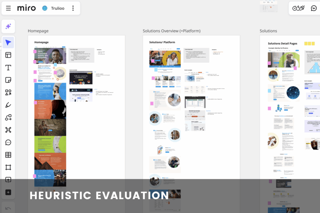
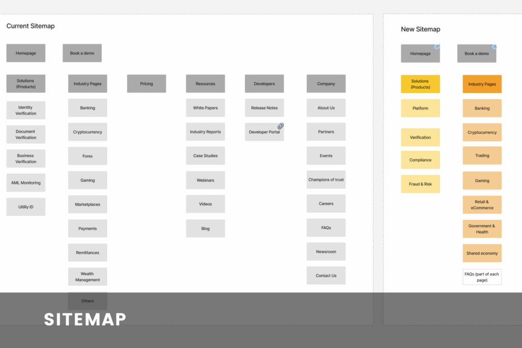
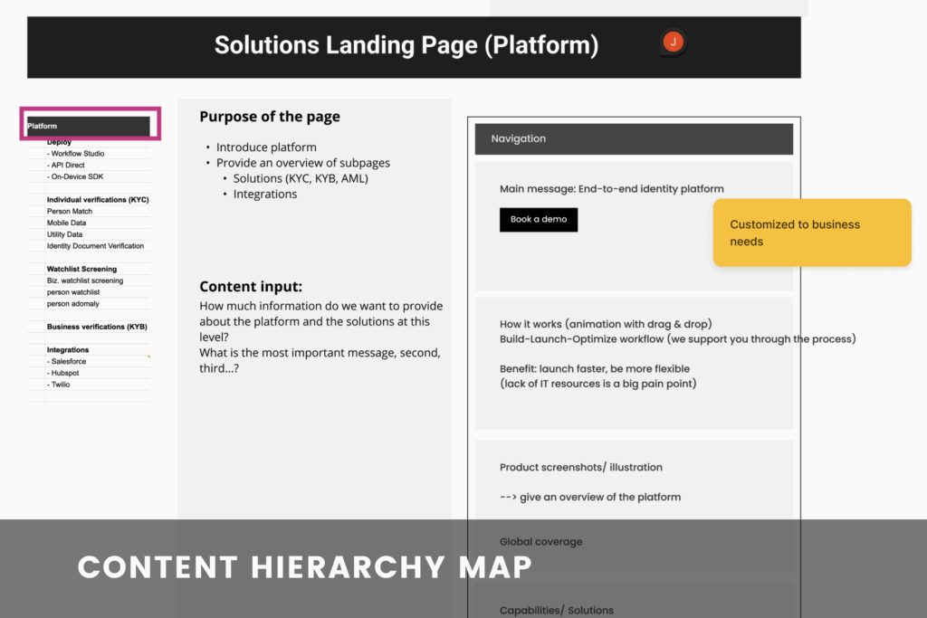
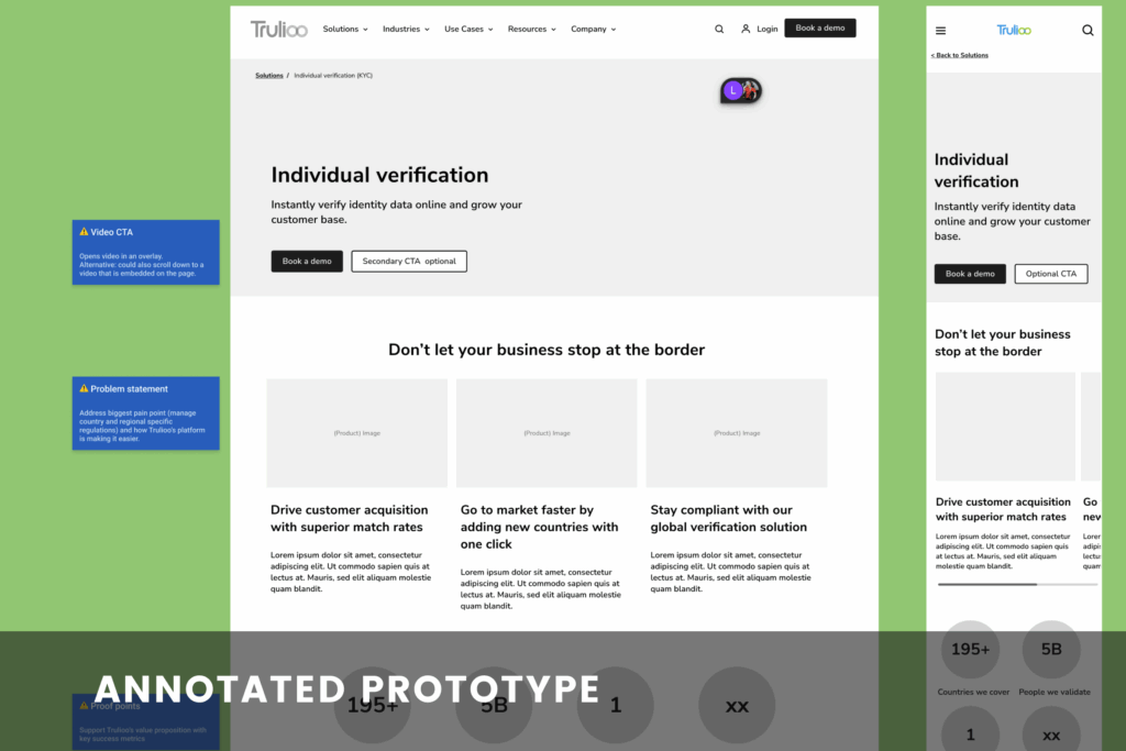
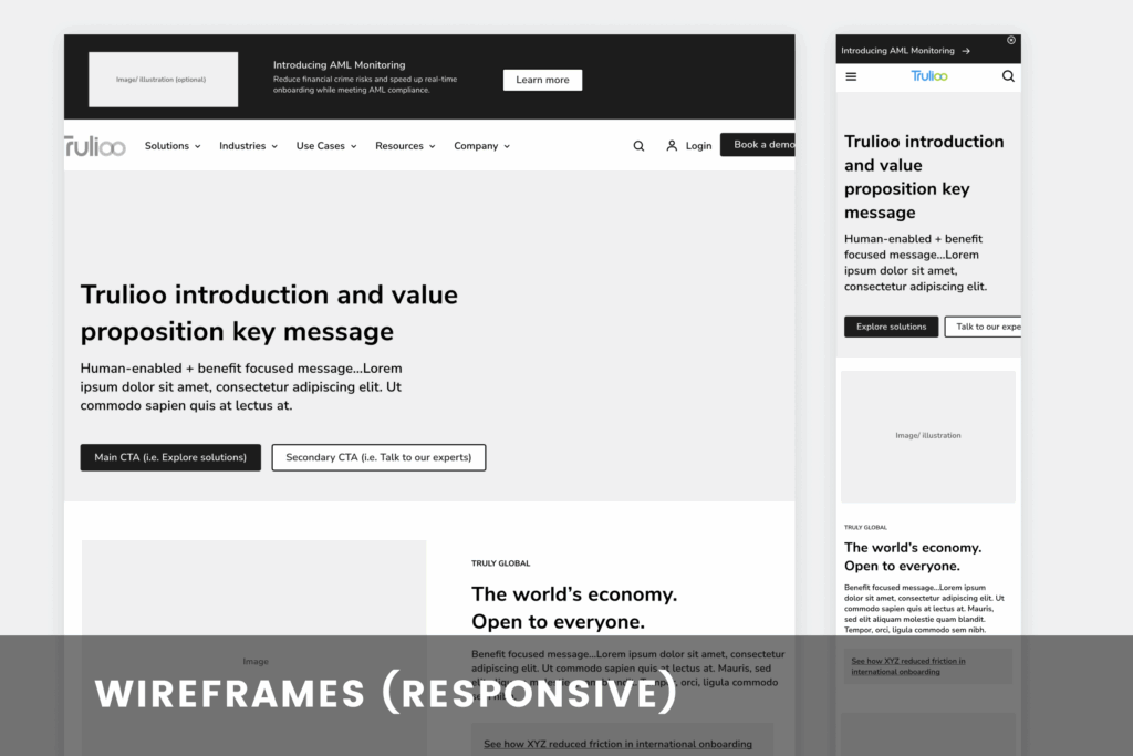
  • Navigation was clunky and confusing.

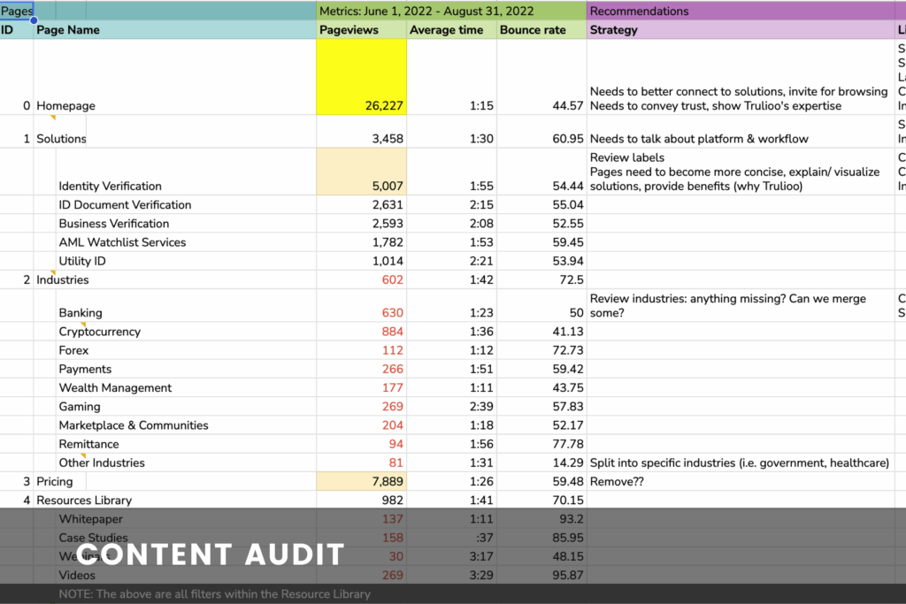
  • Content wasn’t structured to support new products.

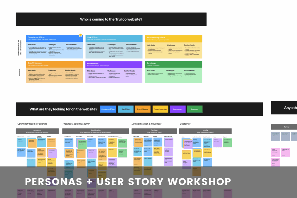
  • Internal teams (SEO, marketing, product) struggled to align on user needs and priorities.

They needed more than a new look—they needed a clear content strategy and better user experience to support growth.

The Approach

I didn’t just jump into design. First, I helped Trulioo figure out what needed fixing—and why.

1. Discovery & Insights

Heuristic Evaluation
Uncovered major usability issues and content gaps.
Content Audit + Analytics Review
Pinpointed underperforming pages and mapped out opportunities for better content flow.
Personas & User Stories
Refined key user tasks through stakeholder interviews and workshops, setting clear success metrics

2. Content-First Strategy

Content Flow + Navigation Plan
Created a streamlined user journey, helping users discover related content naturally—without losing SEO value.
Content Hierarchy Workshops
Brought SMEs together to define content priorities page by page, aligning SEO, marketing, and product on what mattered most.

3. Collaborative Design Support

Wireframes with Annotations
Delivered interactive, actionable wireframes for the content, UI, and dev teams.
Asynchronous Collaboration
Navigated time constraints and limited SME availability with video walkthroughs and async reviews to keep momentum.

The Results

  • Trulioo launched their redesigned website on time, just as they introduced new products.

  • The site’s navigation became intuitive, improving how users found key information.

  • Internal teams reported faster decision-making and better alignment on user needs.

  • Revenue grew post-launch as the site better supported sales and product discovery.

Key Takeaways

  • UX + Content Strategy = Growth: Great design starts with content flow, not just visuals.

  • Cross-Team Alignment Works: Workshops aligned siloed teams on goals, speeding up the process.

  • Clarity Wins: Clear navigation and task-focused content led to better user outcomes—and business results.

What This Means for You

If your website feels like a maze, or your teams are stuck in silos, I can help you find clarity fast. Together, we’ll align your content, improve your UX, and make your next product launch smoother—and more successful.