
I’ve worked with dozens of teams—marketing leads, product owners, executive stakeholders—who were ready to redesign their website.
And every time, the story starts the same way:
“The site feels outdated.”
“We need better navigation.”
“We’re changing our CMS.”
These are valid triggers. But too often, they become the entire focus.
The problem? Most redesigns are based on assumptions, not clarity. They address symptoms—poor SEO, clunky UX, dated visuals—without ever identifying the root cause.
That’s why so many website redesigns fail before they even begin.
In this article, I’ll walk you through the most common mistakes I see when organisations jump into redesign mode too quickly—and how a clear, strategic discovery process can save you time, money, and internal confusion down the line.
Whether you’re updating your digital presence or starting fresh, here’s what to fix before you open a design file.
What I see Going Wrong in Website Redesigns (and How to Fix It Early)
Over the years, I’ve noticed a pattern.
Teams often kick off a redesign with urgency and good intent. But somewhere along the way, the project starts drifting. Scope gets fuzzy. Decisions slow down. People disagree on priorities.
And by the time they launch?
They’ve spent a significant budget—and still feel like something’s missing.
Here are the three most common traps I see—and the steps I take to help teams avoid them.
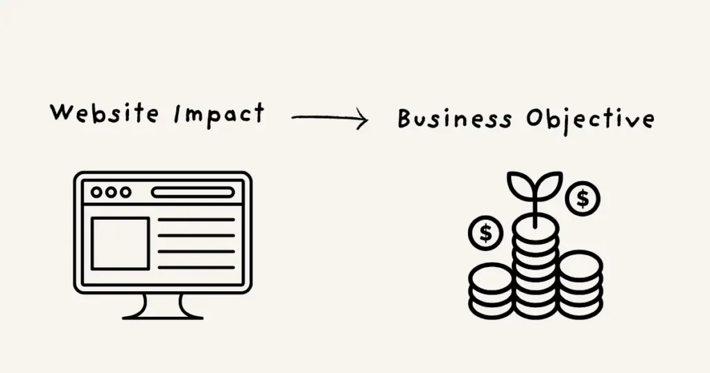
1. No Clear Link Between the Website and Business Goals
This is the big one.
Teams say things like:
- “We want to improve conversion.”
- “We need a better user experience.”
- “It should reflect our brand.”
All true. But often too vague to be useful.
There’s no shared understanding of how the website actually supports business outcomes. No clear answer to:
What do we want this website to do for us—and how will we know if it’s working?
What I do:
- Stakeholder Interviews: I start to collect goals, expectations, and definitions of success from across the organization. It’s surprising how differently teams define success—and how rarely they’ve heard each other say it out loud.
- Success Metrics: Then, I help teams align on measurements for success, not just quantifiable KPIs, but also qualitative checkpoints. Things like:
- Monthly feedback from sales and support
- Micro-surveys for visitors
- Lead quality, not just lead volume
Tip: Ask yourself, “How will we know this redesign worked—six months after launch?” If you can’t answer that clearly, it’s time to pause and align.
2. Unclear or Overgeneralized Audience Understanding
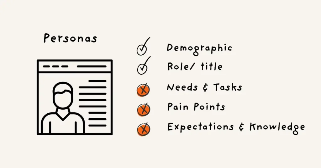
Most teams think they know their audience.
There might even be personas on file.
But often, they’re too abstract or role-based: “CMO,” “Technical Buyer,” “Busy Professional.”
They don’t tell you what people are trying to do, what frustrates them, or what kind of content helps them move forward.
So the redesign ends up being built for a fictional “everyone,” and serves no one well.
What I do:
- Assumptive persona workshops: I facilitate workshops to collect existing customer knowledge, with people from support, sales, and marketing. This surfaces existing knowledge and gaps.
- User research: This step could involve a variety of research methods. I usually start with 1:1 interviews, which are by far the most valuable at this stage. They reveal emotional blockers, motivations, and decision-making behaviour—things surveys simply can’t touch. After that, we might follow up with broader, more scalable research (quant surveys, usability testing, heatmaps) to validate themes.
You don’t need a massive study—you need the right kind of depth.
- Customer journeys: Mapping out the customer touchpoints across the end-to-end experience, not just for the website, reveals where the website fits, and what people actually need from it. This is where we connect the dots. Too often, teams zoom in on features—like a checkout flow or homepage banner. But the real opportunities emerge when we zoom out. Customer journey mapping helps us understand the full experience—before, during, and after someone lands on your website. It answers critical questions like:
- How do people find you in the first place?
- What are they trying to accomplish—and what gets in their way?
- Where does the website fit into their bigger decision-making process?
Tip: Focus less on demographics and job titles. Instead, ask: What’s going on in their world when they land on our site?
3. Content That Reflects Internal Thinking—Not Customer Needs
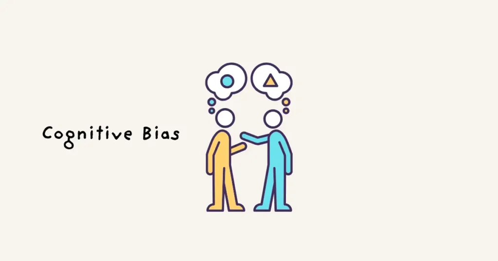
Most of us write content based on what we know—not what our users need.
That’s not because people don’t care—it’s because of cognitive biases.
We all carry our own mental models and assumptions. We think we’re being clear, but we’re speaking our internal language.
And over time, the website becomes a patchwork of updates from different teams, with no consistent voice or structure.
The result?
A cluttered, jargon-heavy experience that’s hard to navigate—even for your own employees.
What I do:
- Content audit: This is not glamorous work. It’s like cleaning out a very messy closet. But it’s worth it. Because it shows you what’s working, what’s not, and where you have real content gaps.
- You’ll find things you forgot you had
- You’ll question why some things were ever written
- And you’ll probably want to throw half of it away
- Usability testing: I use testing that focuses not just on clicks—but on content understanding:
- Can users find answers quickly?
- Do they understand the language?
- Does the content build trust—or confusion?
- Card sorting is another user testing method that helps restructure content based on how your users think—not your internal team’s org chart.
Tip: Choose 3–5 high-traffic pages and test them with real users. Ask what they expected to find—and whether they did. You’ll be surprised what comes up.
What All These Mistakes Have in Common
All of these mistakes stem from the same root cause:
Redesigning before you have clarity.
It’s tempting to jump in. Redesigns feel like progress.
But if you don’t start with strategic clarity, you risk fixing the wrong things—or fixing surface-level problems without addressing the core.
A better design won’t save a broken structure.
And a new CMS won’t fix unclear messaging.
That’s why I always recommend slowing down just enough to ask better questions. The clarity you create at the start will make every decision that follows faster, smarter, and easier to align around.
A Real-Life Example: Assumptive vs Actual Behaviour
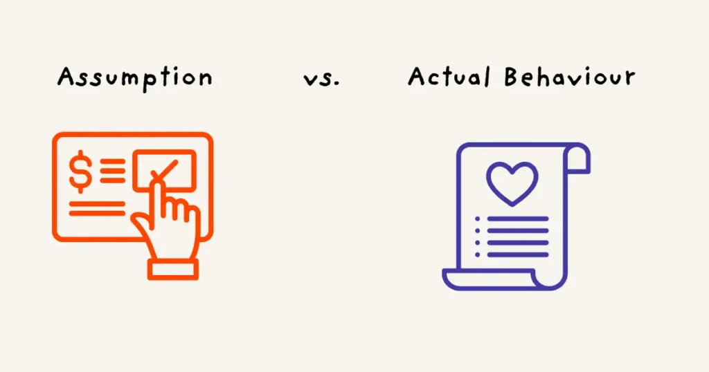
Let me share a quick story that still sticks with me—because it shows how much clarity you can gain from listening, not guessing.
A client came to me with a common problem:
“People are dropping off during checkout. We think the flow needs redesigning.”
This was a small, purpose-driven eCommerce brand selling beautiful handmade soaps and skincare products.
The team had already done a lot:
- They’d pulled analytics.
- Compared competitor checkout flows.
- Tested a sleeker, single-page design to replace their old multi-step form.
But the drop-offs didn’t budge.
So they called me.
And the first thing I asked was,
“What do your customers say about the checkout?”
There was a pause.
They’d sent out surveys—but nothing came back that explained what was going on.
So, we ran a few customer interviews.
Just five to start.
And within days, we uncovered two major insights that changed everything:
1. The Cart Wasn’t Just a Cart
Turns out, many customers were using the shopping cart as a wishlist. They weren’t ready to buy yet.
Some were saving items they loved for a future treat. Others were building gift bundles they wanted to revisit later.
One customer said,
“Oh, I add stuff to the cart when I see something new—but I don’t always check out. It’s more like a list for next time.”
Which explained a big chunk of the so-called “abandonment.”
2. Warm Weather = Melted Products
Another group of customers—especially those in warmer regions—were hesitant to order online. Why?
“I love the body butter, but it’s melted in the mail before. Now I just wait until I’m near one of your stores.”
They were using the cart as a reminder, not a purchase step. The issue wasn’t friction in the form. It was trust in the shipping experience.
What We Did Instead
Here’s what we didn’t do: Another checkout redesign.
Instead, we focused on real solutions:
- Added a proper wishlist feature
- Updated product descriptions to include texture and scent details
- Improved packaging for heat-sensitive products
None of these things touched the checkout flow.
And we didn’t start changing all at once. But within a few weeks of implementing the first batch of changes?
Checkout drop-offs went down significantly.
The Bigger Lesson
If we’d stayed focused on the “checkout problem,” we would’ve missed the real opportunities.
This project reminded me (again) that the clearest answers usually come from asking better questions—and talking to the humans behind the data.
Analytics show you the “what.”
Research tells you the “why.”
And when you’re redesigning a website, it’s the “why” that makes all the difference.
What this means for you
If you’re thinking about website improvements or getting ready for a redesign—this is your moment to pause.
Ask yourself—and your team:
- What are we actually trying to achieve with this website?
- What’s working well right now? (And what’s just… not?)
- Who are we designing for—and what do they need at each step of their journey?
- Where are we assuming we know something… but haven’t actually validated it?
- What does success look like—for us, for the business, for our users?
These questions aren’t just a thought exercise.
They’re the foundation for a strategic website redesign that actually moves your business forward.
Try This:
Take 30 minutes this week.
- Grab a notebook, or open a doc.
- Answer the five questions above—just from your perspective.
- Then share them with a few teammates. Ask for their version.
You’ll quickly see where things align… and where they don’t.
- From there, build a list of pain points, challenges, and gaps.
- Prioritize them using an impact–effort matrix (yes, the classic still works).
And only then—when you’ve got the bigger picture—start shaping your redesign roadmap.
Why it’s helpful
You’ll avoid costly missteps.
You’ll stop redesigning the same things again and again.
You’ll move faster later—because you’ve slowed down now.
And most importantly?
You’ll end up with a website that’s not just prettier—but sharper, clearer, and more useful for everyone who visits.
Further Resources
If you’re not sure where to begin, I’ve got a couple of tools to help you pause, reflect, and plan smarter:
Website Redesign Readiness Checklist
30 questions to help you uncover what’s really going on behind your website issues—before you spend a single dollar on design.
Use it with your team, or just on your own as a sanity check. Get the checklist here.
UX Clarity Sprint
If your team is already in motion—or stuck mid-project—and you need a quick, expert-led reset, this is for you.
In just a few sessions, we map the current experience, align internal goals, uncover user needs, and surface hidden gaps.
No fluff. No waiting months for insight. Just focused clarity that saves you time and budget down the line.
Learn more about the UX Clarity Sprint or book a quick intro call.
FAQs About Website Redesign Planning
1. What’s the biggest mistake companies make when redesigning their website?
Jumping into design before defining the real problem. Without clarity, redesigns are often based on assumptions, leading to wasted time and resources.
2. Do I need to hire a UX expert before a redesign?
Not necessarily. But bringing in someone who can guide stakeholder alignment, user research, and strategic prioritisation can prevent expensive missteps and get better results faster.
3. What if we’ve already started the redesign—can we still pause and reframe?
Absolutely. It’s better to reset mid-project than keep pushing forward without alignment. A strategic pause now can save you months of rework later.
Over to you
Pick one of the tips or exercises in this article that you want to try within the next 30 days to gain more clarity around customer needs, business needs and website requirements.

