Translink

Translink: Digital Screen

UX Design

Time
2 months (2020)

About the Project

Translink, the Vancouver public transportation service, wanted to update its digital displays to improve readability and accessibility.

The Problem

Translink wanted to new LCD displays at one of their busiest bus exchange stations. The displays should provide a better readability, but also include live updates about schedule changes and delays. They were looking for a partner to design the layout of the display. 

Research Phase

We started the project with a research phase to get familiar with current displays and locations.

1. Field research
I went to multiple bus stations, where the new displays should be implemented, to get familiar with size and location for accessibility requirements.
2. Content Research
We did working sessions to identify the type of content that needed to be displayed for specific scenarios (i.e. warning messages, alert messages)

Design Phase

Once we had the requirements in place, we had an ideation session to come up with a display solution that fit the different display screen sizes.

1. Wireframe
I created wireframes for different screen sizes and for different display scenarios.
2. Feedback loop
We had design feedback sessions with multiple departments to align on the final solutions.

Challenges & Restrictions

Designing for flexibel dimensions is part of the responsive design thinking – but in this project we had to think from a different perspectives to account for readability from distances for a variety of settings (the distance between a person and the display varied based on the display location). This was an interesting setup to design for. We were restricted in the technical implementation. This project was unfortunately not set up for a lot of collaboration, which resulted in limited communication between design and technical implementation. 

Outcomes & Learnings

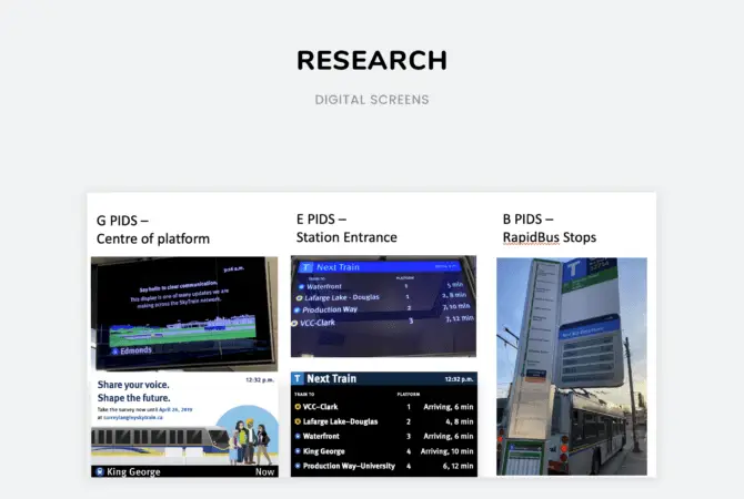
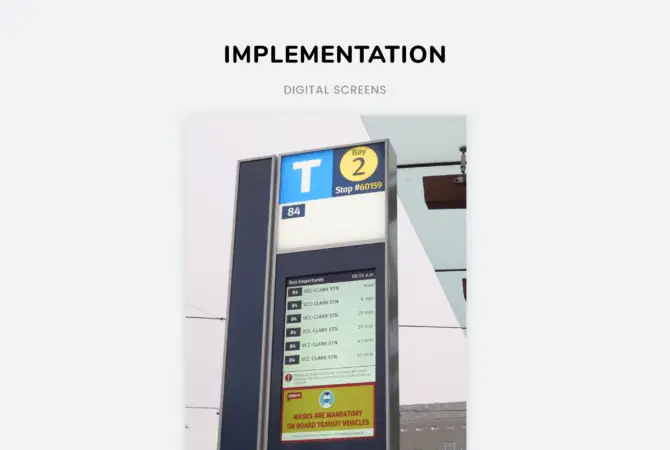
This project allowed me to think differently about screens and dive more into accessibility. I had to think more about the environment a user was in and not just a screen display.

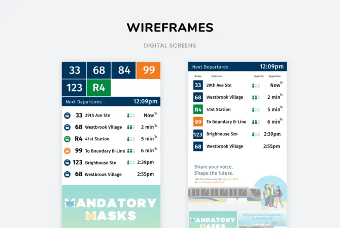
Unfortunatly not all of our fun ideas could get implemented (like the capacity tracker), but it’s great to see the new displays in action!