Beyond Bounce Rate: What Your Website Analytics Don’t Tell You
Beyond Bounce Rate: What Your Website Analytics Don’t Tell You

Stop guessing at solutions. Start understanding the story behind the exit.
Whenever I start a project, I take a look at the analytics numbers – but honestly, they never tell the whole story. Sure, high bounce rates and unfinished checkouts look like big red flags, but they’re just the tip of the iceberg. Sticking to analytics alone will keep you guessing at solutions and miss what’s actually making people leave.
In this article I talk about:
- Data alone can’t explain why visitors leave.
- Real answers come from listening to users.
- It’s about understanding the bigger journey, not just a website.
The Limits of Analytics

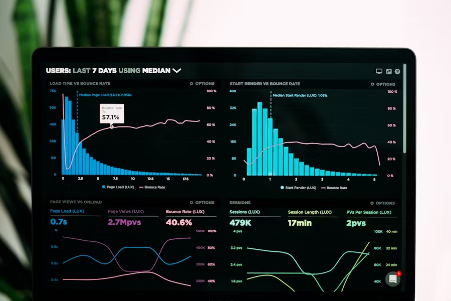
You’re looking at your analytics dashboard – and see some numbers that don’t make you so happy.
You see a high bounce rate for critical pages.
You see people dropping off before completing their purchase.
You see a very low conversion rate for your form.
Your first instinct? Coming up with solutions. “We need to simplify our checkout flow.” “We need to reduce our form fields.” “We need bigger buttons.”
But what we often seem to forget:
Your data tells you what people are doing. It doesn’t tell you why.
And if you don’t understand why users are leaving, then every change you make—every form you simplify, every button you tweak—is just a guess.
That’s how we end up fixing the wrong things.
And worse, that’s how we keep not solving the real problem.
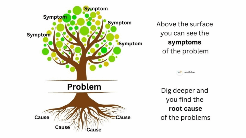
While we think of analytics being the diagnosis, they’re really just symptoms.
It’s like going to the doctor with a fever and having them immediately prescribe ice packs. They’re treating the temperature, not the infection causing it.

Common Misinterpretations of Bounce and Drop-Off Rates
Every abandoned cart or short visit has motivations you’ll never spot in a dashboard. Maybe someone got pulled away by a call, worried about shipping, or just needed to check with a partner. Analytics won’t show any of that.
Here are a few real-world reasons data just can’t catch:
- Not trusting payment methods
- Unanswered questions about a product
- Worried about missing a better deal elsewhere
- Life distractions—kids, work, whatever
Even heatmaps and click tracking only show where someone clicked, not what was running through their head. If I don’t talk to real users, I’m just guessing. Analytics get me started, but they’ll never replace real conversations if I want to know what’s actually going on.
Seeing Websites as Part of the User Journey
Websites rarely stand alone in a user’s decision process. Instead, they are part of a larger set of steps people take, often involving different channels and moments.
Your website Is just one scene in a longer movie.

Let’s say you’re selling running shoes online.
Before someone clicks “buy,” they’ve already:
- Decided they need new shoes (old ones worn out, training for a race, foot pain)
- Researched what type they need (trail vs road, stability vs neutral)
- Set a budget and timeline
- Compared brands and read reviews
- Maybe visited a physical store to try on sizes
When they land on your site, they’re not starting their journey—they’re continuing it.
If they add shoes to their cart and leave, you see “cart abandonment.” But they might be:
- Waiting for payday
- Comparing your price to three other sites
- Planning to buy in-store to avoid shipping time
- Checking if their running group gets a discount
If you focus only on what’s happening on your pages, you’ll miss the bigger story. But in order to design experiences that fit where people really are, you need to understand the whole story instead of guessing why they left at a certain point.
The Risks of Assumption-Driven Problem Solving
In over a decade of user research, I’ve learned that surface-level behavior rarely tells the full story. The real insights come from digging deeper.
Here are four examples where the obvious fix would have been completely wrong:
The Checkout That Wasn’t Too Long
What we saw: 60% of users abandoned checkout after reaching the payment page.
The obvious fix: Shorten the form, reduce friction, make it faster.
What we discovered: Users couldn’t find their preferred payment method and didn’t trust the available options.
What actually worked: Adding more payment providers and clarifying the refund policy—not reducing form fields.
The Contact Form Nobody Used
What we saw: High traffic to the contact page, but only 3% form submissions.
The obvious fix: Simplify the form, remove unnecessary fields.
What we discovered: Users preferred speaking to a real person and doubted they’d get a response to an online form.
What actually worked: Adding live chat and a callback option, plus setting clear response expectations (“You’ll hear back within 4 hours”).
The Product Pages That “Didn’t Convert”
What we saw: 70% bounce rate on key product pages.
The obvious fix: The products weren’t interesting—deprioritize them.
What we discovered: People were genuinely interested but missing crucial information about how the product worked and what made it different.
What actually worked: Adding comparison charts, video demonstrations, and detailed specifications—not changing which products we promoted.
The Mobile Users Who “Couldn’t Convert”
What we saw: High mobile traffic, low mobile conversions.
The obvious fix: Optimize the mobile checkout experience.
What we discovered: Users were browsing on mobile but planning to complete purchases on desktop later.
What actually worked: Cross-device cart saving and gentle email reminders—not mobile UX improvements.
The pattern: In each case, the surface-level assumption wasn’t wrong—it was incomplete. And without asking real users what got in their way, we would have kept solving the wrong problem.
How to Uncover the Real Story
You can’t really see why users leave just by staring at numbers. Analytics miss your users’ feelings, needs, and motivations that drive their choices. But when you talk to real people and watch them use your site, you find problems and opportunities that data alone never reveals.
This is where qualitative research comes in. Interviews, open-ended surveys, and usability tests let me hear from users in their own words.
To get you started, I am sharing some quick ways to collect user insights:
1. Mine Your Existing Conversations
- Ask sales/support: What questions do prospects ask before converting?
- Review chat logs: What objections or confusion points keep appearing?
- Check help desk tickets: What do people struggle with most?
2. Add Strategic Exit Surveys
Don’t just ask “How was your experience?” Ask:
- “What were you hoping to find on this page?”
- “What stopped you from taking the next step?”
- “What would you need to see to feel confident moving forward?”
3. Track Micro-Conversions
What are users doing before they leave?
- Clicking on FAQs or help sections
- Hovering over pricing information
- Downloading resources or guides
- Scrolling to testimonials
4. Interview Recent Non-Converters
Reach out to people who visited but didn’t convert:
- “You checked out our product last week but didn’t sign up—what happened?”
- “What would have made the difference?”
- “What questions did you have that we didn’t answer?”
5. Test Your Assumptions
Before redesigning, test whether your hypothesis is correct:
- If you think the form is too long, try removing one field
- If you think the CTA is unclear, test different wording
- If you think people need more information, add an FAQ section
Just remember: this are “research starter ideas”. To understand your customers better, you want to develop a research culture. User research is not a checkbox item on your todo list: once completed you know everything. No. It’s a mindset and a habit you need to create to not loose touch with your customer needs.
How to Identify Solutions and Prioritize
Try to look at website exits like you’re reading just one page from a bigger story. By digging into where people come from and where they head next, you can spot patterns and real motivations. That helps you focus on what matters in their journey, not just the surface-level stuff.
One favorite method of mine is customer journey maps: mapping out steps before and after a user exists will help you to understand your customers thinking and expectations better. It will reveal the bigger context behind the decisions and behaviour.

To identify what needs to be fixed, zero in on decision points where users either pause or leave. If many people stop on the return policy page and then disappear, that’s a significant clue. These are the moments where doubts, questions, or outside distractions tip the scale.
If you need more information about the WHY, you can directly engage with real customers or deploy quick surveys about that specific interaction. This helps you identify the specific obstacles or confusion that caused them to leave. Now you turn anonymous clicks into meaningful stories—and you can use those insights to create a site that feels more helpful and genuinely human.
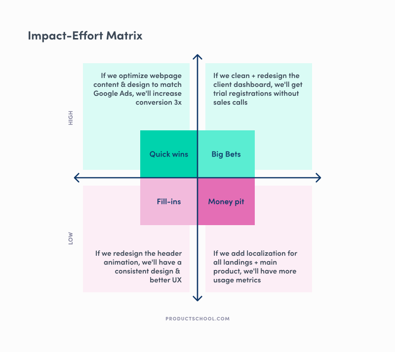
In order to prioritize ideas, I often use an impact-effort matrix: for each of your solutions, decide how low or high your effort will be to create this solution and how low or high the expected impact will be.

This is a simple way to identify quick wins vs long-term and high-impact solutions.
Conclusion
If you want to figure out why folks leave your website, you can’t just guess. You really have to ask real people and actually listen to what they say—sometimes the answers are surprising.
User research gives you insights that analytics just… miss. When you talk to people, watch them use your site, or even toss out a quick survey, you start picking up on what genuinely matters to them. It’s not always the stuff you expect, either.
The real story is always in the why. And the why is always worth asking about.
Want to dig deeper? Here are three questions to ask about your highest drop-off pages:
- What were users trying to accomplish when they arrived?
- What information or capability did they need that we didn’t provide?
- What would have made the difference between leaving and staying?
The answers will tell you more than any analytics dashboard ever could.
