How to design for trust: what psychology teaches us about credibility
How to design for trust: what psychology teaches us about credibility
Building trust is one of the most critical elements for every brand. Whether you’re brand new or well-established, you still face the same challenge: how do you quickly communicate to a new prospect what you offer and why you’re the right choice?
There are plenty of marketing playbooks out there that rely on familiar tactics like testimonials, client logos, and case studies. But if we want to build real, lasting trust, we need to dig deeper.
In this article, we’ll explore what psychological research teaches us about how trust is formed online—and what that means for your website design and brand perception.
The Trust Gap: How lack of trust shows up
Trust issues on your site don’t always scream “trust issue.” They hide in symptoms like:
- High bounce rates
- Low signups or demo bookings
- Ghosting after the first contact
- Long decision cycles and stakeholder pushback
The frustrating part? You may never hear “we didn’t trust your brand.” People just quietly opt out.Trust doesn’t build over time if the first impression is off. Most websites only get one shot.
What we know from psychology: The foundation of trust
Psychologists differentiate between two main types of trust:
- Cognitive trust: Built on perceived competence, reliability, and integrity. “Do I believe this company knows what they’re doing?”
- Affective trust: Built on emotional connection, empathy, and a sense of care. “Do I feel safe, understood, and respected here?”
Trust is shaped by both logic and emotion. But key psychological influencers consistently show up across both:
- Consistency
- Reliability
- Authenticity
- Empathy and emotional acknowledgment
These aren’t just abstract values. They’re designable experiences—and we can see them in action across some of the world’s most trusted brands.
Apple builds trust through a seamless blend of cognitive and affective cues. On the cognitive side, everything from their product packaging to the Genius Bar experience reinforces reliability and technical excellence. But they also excel at affective trust: their advertising taps into emotion, identity, and aspiration, making users feel something deeper than product features.
IKEA similarly mixes both. Cognitive trust comes from knowing what to expect—flat-pack furniture, consistent pricing, and predictable layouts across every store worldwide. Affective trust shows up in their playful tone, cozy catalog photography, and emphasis on real-life scenarios that feel familiar and warm.
When we break down trust in this way, it becomes clearer how our design choices—visuals, tone, structure, and content—can shape how people feel about a brand before they ever make a purchase.
Frameworks & Concepts: How trust forms (and how design affects it)
Trust isn’t formed by accident—it’s triggered by specific cues our brains are wired to pick up on. Here’s a closer look at six psychological concepts that influence trust, along with how they show up in digital design and real-world brand examples:
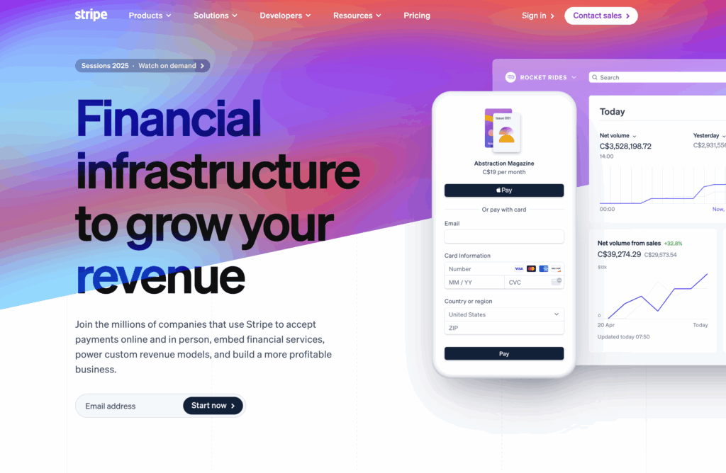
The Halo Effect
We assume that if one aspect is good, the rest must be good too.
- Psych insight: A clean, modern design can create a positive impression that extends to product quality and reliability.
- Design angle: First impressions are everything. Visual polish, clear hierarchy, and thoughtful layout influence how people perceive your credibility. (Remember: a first impression does not necessarily happen on your homepage.)
- Example: Stripe nails this with sleek design, high-end typography, and polished visuals. Their design signals competence, even before you read a word.
Cognitive Fluency
We trust things that are easy to understand.
- Psych insight: When something is easy to process, we perceive it as more true, safe, and familiar.
- Design angle: Clear navigation, plain language, and visual clarity reduce cognitive load—and build trust by helping users feel smart and in control.
- Example: Trulioo uses plain copy, generous whitespace, and logical structure to guide users without overwhelming them.

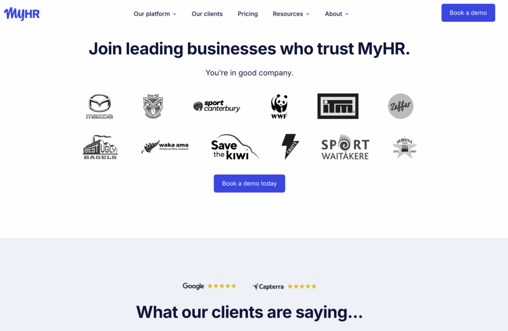
Social Proof
We look to others when we make decisions.
- Psych insight: Social validation is a shortcut the brain uses to make faster, safer decisions—especially under uncertainty.
- Design angle: Logos, testimonials, star ratings, and case studies can all signal credibility—if they’re specific, relevant, and authentic.
- Example: MyHR features testimonials from major companies and in-depth case studies showing exactly how teams benefit.
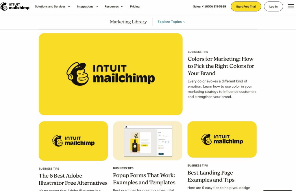
Consistency
Predictability and repeatability signal reliability.
- Psych insight: Inconsistent behavior raises red flags. People trust things that behave the same way across time and touchpoints.
- Design angle: Maintain consistency in your brand voice, visual style, button behavior, and navigation. It builds familiarity and comfort.
- Example: Mailchimp has a distinct, friendly tone that shows up in every part of their experience—from onboarding to error messages.
Transparency
People don’t like feeling like something is hidden.
- Psych insight: People are more willing to commit when they know what to expect—especially in unfamiliar or risky situations.
- Design angle: Show your pricing. Explain your process. Be clear about what happens after a click.
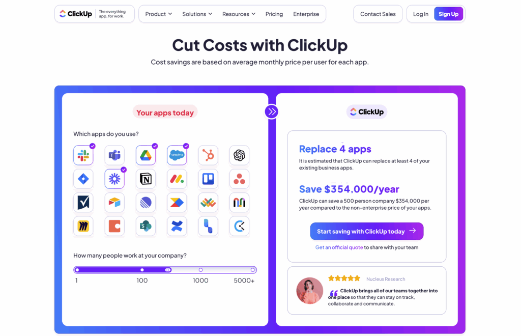
- Example: ClickUp keeps it simple and honest and provides a cost calculator.
Emotion
We trust those who feel human.
- Psych insight: Emotional resonance creates affective trust—built on empathy, safety, and shared values.
- Design angle: Tell human stories. Use warm tone. Highlight real people (not stock images). Invite emotional connection.
- Example: Patagonia builds affective trust through storytelling and photography that center around adventure and personal experiences.
These frameworks aren’t mutually exclusive—brands that build real trust often weave multiple elements together to create a cohesive, credible experience.
Common Trust Failures on Websites
Even the best-intentioned websites often undermine trust in small—but critical—ways. Here are some common pitfalls to watch for, along with real-world examples (screenshots encouraged!) to bring them to life:
Brand-Level Trust Breakdowns
- Vague value propositions: When it’s unclear what the company does or who it’s for.
- Example: A startup homepage with buzzwords like “innovative solutions” and “transforming the future”—but no tangible product explanation.
- Faceless brands: No team, founder, or human element visible.
- Example: A service-based company with no About page or team bios, leaving visitors wondering who’s behind the work.
- Inconsistent tone or branding: Visual or messaging disconnects across pages.
- Example: A modern homepage with slick visuals, followed by a dated blog layout with dry corporate language.
- Lack of focus: Trying to speak to everyone, which ends up resonating with no one.
- Example: A SaaS site that lists 10 industries and 15 use cases on the homepage without a clear entry point.
Service or Product-Level Trust Breakdowns
- No real-world proof: No case studies, outcome data, or third-party validation.
- Example: A software tool that claims to “streamline your workflow” without showing how it’s used or who uses it.
- Over-polished but hollow design: Pretty pages without substance.
- Example: A beautifully designed landing page with vague copy, zero testimonials, and no mention of pricing.
- Hidden or confusing pricing: “Contact us for pricing” is a red flag for many buyers.
- Example: Enterprise SaaS landing pages with no transparent pricing tiers.
- Unclear CTAs: Users don’t know what will happen after they click.
- Example: A “Request Access” button that doesn’t explain whether it leads to a trial, demo, or sales call.
These small friction points compound quickly. One moment of doubt can undo all the trust you’ve worked to build elsewhere.
How to Increase Trust on Your Website
Now that we’ve covered what not to do, here’s what you can start doing right now to build trust more intentionally. This list includes concrete ways to adjust your content, design, and overall site experience:
Clarify Your Message
- Make your value proposition obvious within the first 5 seconds.
- Use clear, jargon-free language that speaks directly to your audience’s needs.
- Add a one-liner or headline that sums up what you do and who it’s for.
Humanize Your Brand
- Show the team behind the product—add photos, names, or founder stories.
- Use real customer quotes with names, roles, or company info.
- Create “About” pages that feel personal, not boilerplate.
Prove It Works
- Include outcome-focused case studies or success stories.
- Use specific metrics (“35% increase in demo requests”) where possible.
- Highlight logos or partners that carry relevance to your audience.
Be Transparent and Reassuring
- Clearly explain pricing, trial terms, and what happens after a CTA.
- Add FAQs that pre-empt doubts and address real concerns.
- Link to your privacy and data policies from relevant touchpoints.
Make Navigation Effortless
- Stick to predictable patterns for menus and buttons.
- Avoid overwhelming users with too many choices or nested pages.
- Use headings, spacing, and microcopy to guide attention.
Speak to Emotion and Logic
- Balance rational proof points with emotional tone—why your brand exists, what you care about.
- Use testimonials that go beyond “It’s great!” and share personal impact.
- Share behind-the-scenes content or team perspectives to invite empathy.
Keep It Consistent Across Devices
- Ensure your mobile experience is just as smooth and credible as desktop.
- Align tone and visual style across channels (email, social, landing pages).
Small tweaks across these areas can collectively shift how your brand is perceived—and how much your audience is willing to trust you.
Takeaway: The 5-Minute Trust Check
Here’s a quick trust audit you can use to spot red flags on your website. Grab your homepage (or any high-impact landing page), set a timer for 5 minutes, and ask:
- Is it clear what we do and who it’s for within 5 seconds?
- Do we look and sound like real humans, not corporate jargon machines?
- Are we backing up our claims with specific proof—case studies, numbers, or recognizable clients?
- Is the next step obvious and low-risk (e.g., free trial, clear pricing)?
- Does the design reflect care, attention, and consistency across all touchpoints?
If you’re unsure about any of these, your site might be creating invisible friction.
Trust isn’t just a feeling—it’s a strategic advantage. And with the right design and content choices, you can build it on purpose.