Simplify complex information architecture
Simplify complex information architecture

I had the chance to listen to a very inspiring presentation by Anton and Irene, both working at Fantasy Interactive. They do an amazing job when it comes to simplify websites and create unique and accessible user experience.
They talked about their latest redesign, Wacom.com – and Irene talks about the process on her website.
I really like how they start their process: deep dive into the existing content, understanding what is out there already – and then make it almost physical and tangible:
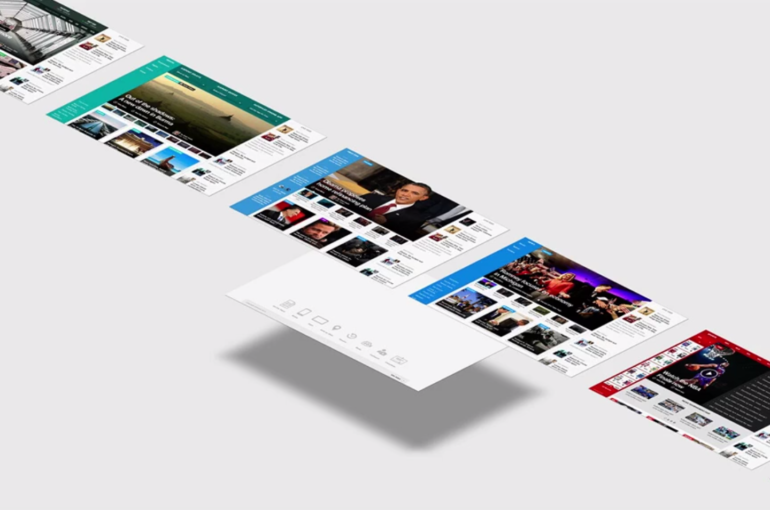
Besides focusing on the overall architecture of the entire site, we also mapped out what content will go where on the product pages. We call these layers “layer cakes”, as it kind of looks like a big layer cake. At this stage we do not define the actual layout or content just yet, we are simply trying to map out what will go where.
Anton and Irene provided another great peak behind the curtains about their way of redesigning USAtoday.com – thanks for sharing your experience!

